
What's in a Color Grade?
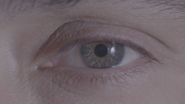
One of the most crucial steps in creating an ad that grabs the eye and doesn't let go is a great color grade. However, no other step in the production process is as overlooked by clients not familiar with the filmmaking process. So, what exactly is a color grade? Basically, a color grade is the process of taking an image like this:
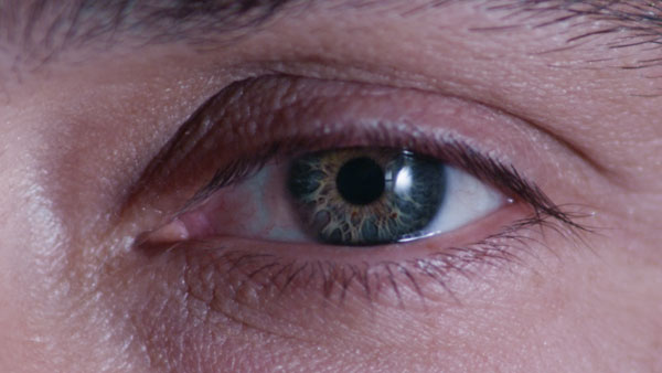
And making it look like this:
There are many systems that allow for fine tuning of your imagery these days, but not all are created equal. Is a production company using built in color tools? Magic Bullet Looks? A full Da Vinci suite with control surface and calibrated monitor? These questions will affect how much bang you get for your buck, as well as how your ad impacts your viewer. How do you create an image that makes them stop mid-fast-forward on their DVR and watch your spot? Increasingly in this age of unlimited choices in post production, what can separate the tone of one company's message from the next--and what can set apart the top tier of commercials and branding videos--comes not only from the color grade, but the working knowledge the Director of Photography has with the color grading process. Some of the best cinematography these days is designed from the onset with the grade in mind. Think of particular images in television and web advertising that have made you stop and look. This is becoming rarer amidst the deluge of imagery our brains are now trained to filter through constantly. If an image did catch your attention from the noise, chances are a big part of it is in the color grade, which also means:
Your colorist is vital to your production.
Directors, DPs, Editors and more are all absolutely vital to your production. These are the vital team members pretty much every producer or client thinks of when they are putting together a plan for their production. But also crucial is a skilled colorist, the artist who knows just how to tweak an image to make the viewer go "wow". It's more than slapping a pre-defined "look" on some existing footage. Like great writing or music, it is finding the perfect accent points, seeing what is beautiful or vital in each frame and heightening the effect (or diminishing it--whatever serves the commercial best). Before deciding on a production company, ask to see a reel of their staffs' color grading. See why they made the choices they did, and compare their philosophy to the way the image made you feel when you first saw it. If their images stick with you and their message was impactful, chances are they'll stick with your target audience as well.


